The Universal Interface of Liquid Glass: Why Apple Invented Glass and Windows 11 for iPhone and Mac OS? The Story Behind Its Origins
Liquid Glass uses real-time rendering and will respond to movement. Apple is using it on buttons, switches, sliders, text, media controls, and even lager surfaces like tab bars and sidebars. The Liquid Glass design inspired Apple to redesign its controls, tools, and navigation within its apps.
Aqua, which was first introduced in 2000 in iMovie 2, was the first glass theme that Apple has used. macOS 11 Big Sur also introduced a big redesign to the macOS UI, with more rounded corners, greater use of transparent and translucent layers, and a slew of new icons.
Microsoft has also been using transparency effects in its Windows operating system since it launched Windows Vista in 2007, complete with its own Aero Glass theme. Windows 11 now uses Microsoft’s Fluent Design language, which has more of a focus on 3D, colorful, and playful elements.
Design, to quote a wildly overused Steve Jobs-ism, is how it works. And if that’s the case, Apple’s new design language, which the company is calling “Liquid Glass” and just announced at WWDC 2025, is really nothing new at all.
The thing about most of Apple’s devices is that they aren’t overlaying digital information on the physical world. They’re just screens! It won’t feel like you’re moving something around; you’ll feel like you’re looking at a fake water droplets on the screen. The controls that appear to float above your content, reminiscent of a hokey 3D effect, look to my eyes a little out of place. The navigation buttons that ripple as you scroll a webpage don’t look like physical objects — they just look busy and hard to read. The constantly changing interface of Liquid Glass seems even more noticeable because Apple often states that it is minimalist and keeps your content in focus.
It is pretty obvious that this is where Apple came from. It obviously wouldn’t, and probably couldn’t, fundamentally change the look and feel of every device it makes for billions of users around the world. No one wants that. Apple took all of its elements and made them universal, which means that everything is a little bit more round, a little more contained, and a little less designed for a specific screen size. A floating menu of black and white icons works pretty much anywhere, you know? By making the menu lists pop out of buttons, Apple avoids having to change every menu for every device and screen orientation. Liquid Glass is the lowest common denominator, done about as well as you could.
Let me show you just how dramatically it changes things. I shared a picture of my lockscreen with David Pierce in the Installer newsletter last month and now I have a lock screen on my iPhone 16 Pro with the Apple software up and running.
The control center is a mess right now. My gray homescreen is cluttered because of the transparency of Liquid Glass. I want Apple to make the Control Center a bit more translucent so that people can easily read it at a glance.
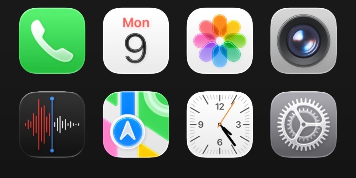
The Clock app shows a good example of the finer details that have changed. The bottom tab bar is rounded, and when you tap different tabs, the selector shifts over in an animation that I can best describe as a water droplet moving across the tab. (Pressing and holding the droplet allows you to drag it across the tab bar, which is an admittedly cool effect.) You might also notice that the button to turn the alarm on and off is more oval than circular.
My iPhone still functions like it used to. I have a lot of small complaints, especially with the spacing of settings functions and Control Center. I think Apple will make a lot of fixes and improvements in order to make the official launch ofiOS 26 this fall a success.


